
The Real Cost of a Static Web Design in B2B SaaS
When people talk about B2B SaaS websites, the conversation often revolves around messaging, branding, or visual polish. Layouts are reviewed in static design files, stakeholders approve screens, and everyone feels confident that the site is ready to perform. Yet once the website goes live, reality often tells a different story.
Users hesitate, engagement drops earlier than expected, and conversion rates fail to reflect the effort invested in design and copy. In many cases, the issue is not the message itself, but the way that message is experienced. Static design can show what a website looks like, but it rarely shows how it behaves. And that gap comes with a real cost.
Why static design feels safe, but hides real problems
Static screens feel reassuring. They are easy to review, easy to share, and easy to approve. Everyone sees the same frame, the same layout, and the same call to action. On the surface, alignment seems achieved.
The problem is that users never experience a website as a static image. They scroll, hover, click, hesitate, and react. Without motion or interaction, important questions remain unanswered. Does the primary call to action feel responsive? Does the hero section guide attention or overwhelm it? Does the page flow naturally, or does it feel abrupt once you start moving through it?
These questions only surface once behavior is introduced. If that happens late, teams are forced to react instead of learn.
A concrete example: Asana versus an interaction-first approach
A good way to understand the real impact of interaction is to look at established SaaS products that already have strong branding and clarity, but still rely heavily on static presentation.
Take Asana as an example.
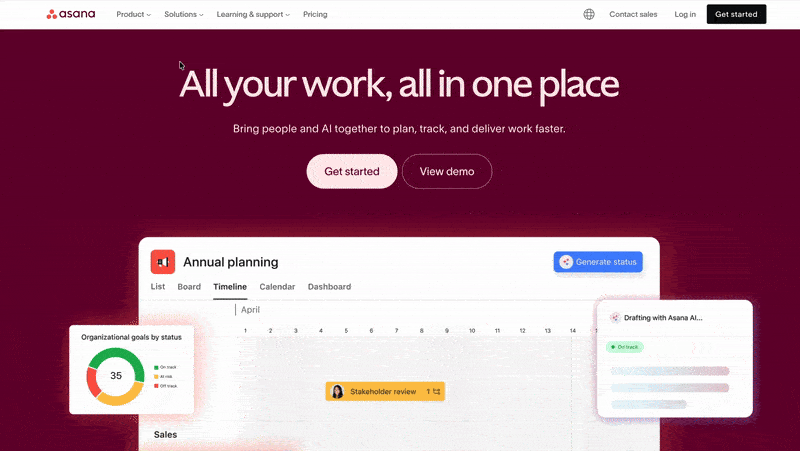
Asana communicates trust, scale, and product maturity very well. The messaging is clear, the visuals are polished, and the value proposition is easy to grasp. However, much of the experience remains visually static. The product is powerful and dynamic, yet the website largely relies on static sections to explain that complexity.
With more purposeful motion, Asana could elevate the experience further. Subtle transitions could help explain how work flows across teams. Interactive cues could guide attention through complex concepts without adding copy. Motion could reinforce the sense of quality and craftsmanship that the product already delivers inside the app. In this case, interaction would not be decorative, but explanatory. It would help translate product depth into perceived value faster.
Now contrast that with our recent work on the website for ClearBlade.
ClearBlade operates in a technically complex space. The challenge was not only to explain what the platform does, but to help visitors feel confident navigating that complexity. By introducing interaction early, we were able to test how motion supported clarity rather than distraction. Transitions were used to pace information, interactive elements helped structure dense content, and visual feedback reinforced hierarchy and intent.
The result was not just a more engaging site, but a more informative one. During analysis and validation, interaction surfaced insights around scroll behavior, content grouping, and user attention that would have been invisible in static frames. Those insights directly informed design decisions before development began, reducing rework and improving alignment across teams.
What these two examples highlight is not a difference in brand quality, but a difference in approach. Static design can communicate what a product is. Interaction helps communicate how it works, why it feels reliable, and what level of quality users should expect. For B2B SaaS products especially, that distinction often makes the difference between interest and conviction.
Static versus interactive: a practical contrast
Consider a SaaS landing page where the primary goal is to drive demo requests. In a static design, the CTA may be clear, but its effectiveness is assumed rather than tested. Once interaction is introduced, teams can immediately see whether feedback feels strong enough, whether transitions support focus, and whether the experience encourages progression.
An interactive version often reveals insights that static frames hide. Maybe the button needs more emphasis. Maybe the scroll rhythm feels too fast. Maybe users benefit from a small visual cue that confirms their action. These adjustments are small, but their impact on conversion and usability is significant.
Without early interaction, these lessons are learned late, often during development or after launch.
The real business cost behind static approval
The cost of static design is rarely just visual. It shows up as lost conversions, slower iteration cycles, and higher rework costs. Teams spend time debating design intent instead of validating behavior. Developers are asked to interpret interactions that were never defined. Marketing teams launch campaigns based on assumptions that do not fully reflect the live experience.
All of this slows learning. It increases friction between teams. It pushes important decisions further down the line, when they are more expensive to change.
Introducing motion earlier in a realistic way
Introducing motion early does not mean building full production animations or overengineering prototypes. In practice, it means validating a few key behaviors before development starts. This usually includes how the hero responds to scroll, how primary CTAs react to interaction, how navigation flows, and how important sections transition.
By doing this early, feedback becomes grounded in experience rather than opinion. Stakeholders react to what they feel, not what they imagine. Decisions become clearer, faster, and more aligned with user behavior.
How interactive validation changes the process
When interaction is part of the design conversation from the beginning, the entire process shifts. Designers communicate intent more clearly. Developers receive more concrete direction. Marketing teams gain confidence that what they promote matches what users will experience.
Instead of discovering problems late, teams learn early. Instead of fixing issues reactively, they make informed choices proactively. Over time, this leads to more consistent performance and fewer surprises after launch.
Check out how we quickly do it here.
A more intentional approach to B2B SaaS design
At Noco, motion and interaction are treated as core elements of clarity and conversion, not as decorative layers. We use interaction to validate hero sections, call to action behavior, navigation patterns, and key transitions early in the process. This allows teams to understand how a website actually behaves before committing to development.
The goal is not to add complexity, but to remove uncertainty.
Final takeaway
Static design is useful, but incomplete. It captures structure and intent, not behavior. For B2B SaaS teams, the real cost of static design lies in the decisions that are delayed, the insights that are missed, and the conversions that never happen.
By introducing motion and interaction earlier, teams gain clarity, align faster, and build websites that not only look right, but feel right from the moment users arrive.
FAQs
More reads
A practical guide for B2B SaaS teams choosing between Framer and Webflow, with clear recommendations, real insights from our experts and the data you need to pick the right platform for your next stage of growth.
.png)
Picture this: A prospect asks ChatGPT about your B2B SaaS product. The AI pulls data from across the web and... finds nothing useful. Or worse, it shows outdated third-party content instead of your actual site. This happens more often than you'd think. But there’s a dead-simple fix.

The world of Webflow and web design comes with its own unique vocabulary, and understanding these terms is crucial for effective communication between designers, developers, and clients.