
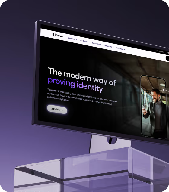
The website behind a $1B identity platform: Prove.com
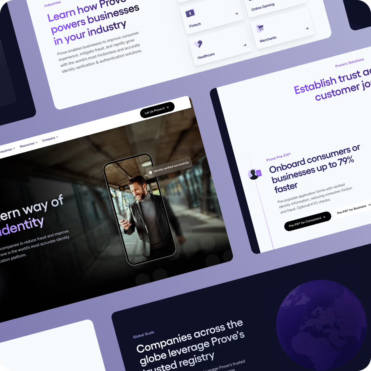
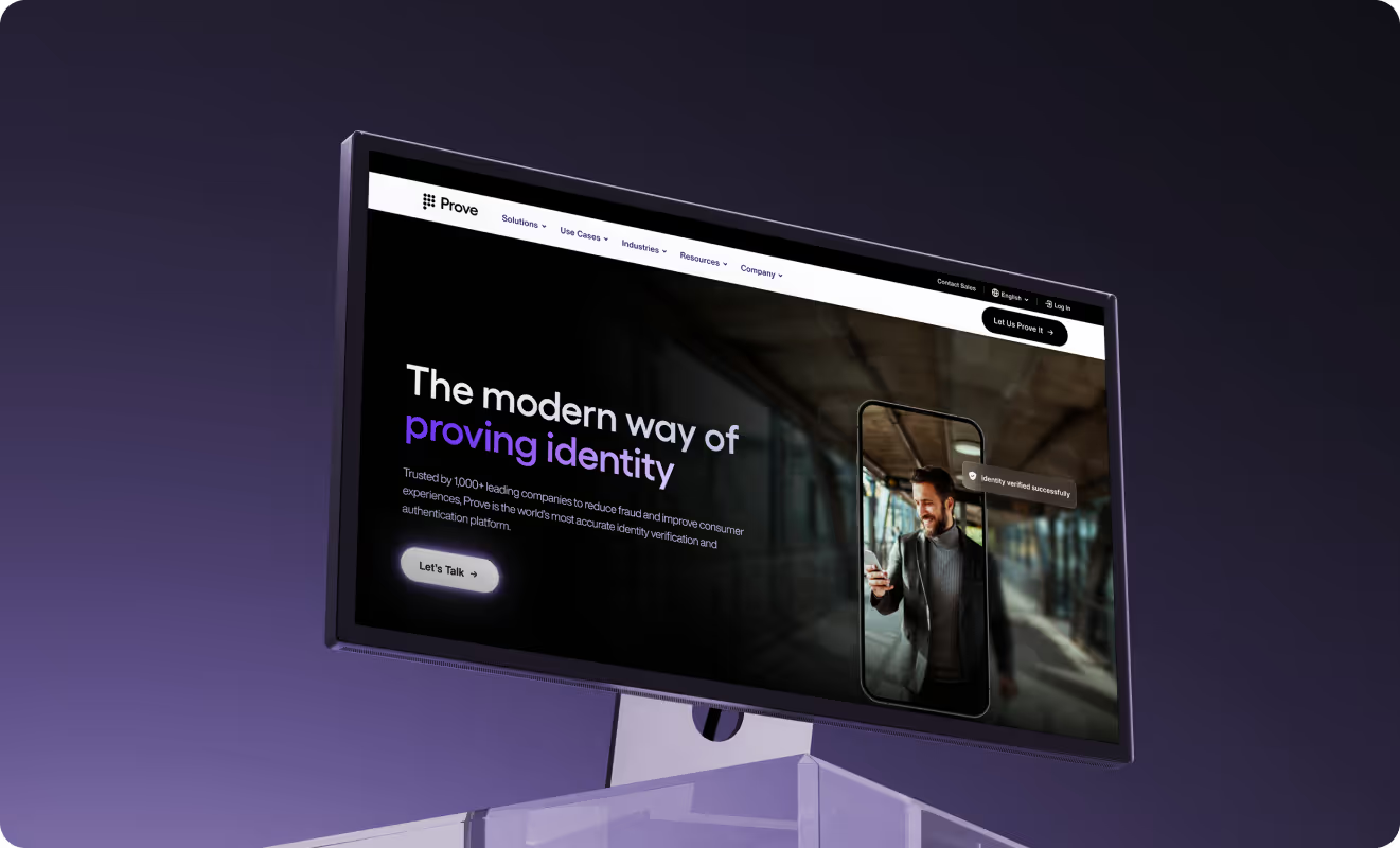
Prove is one of the world's leading identity verification and authentication platforms, trusted by more than 1,500 enterprises including seven of the top ten US banks. When the engagement started in 2023, their website was already in Webflow, functional but falling short of the enterprise standard their buyers expect. We went straight into a PRO subscription, giving us the sustained capacity to rebuild the site phase by phase, establish a design system from the ground up, and layer in CRO as the platform stabilized. The work is still running.
Background and objectives
Prove sells phone-centric identity verification and authentication to some of the most security-conscious buyers in the world. Their platform manages over one billion identity tokens, operates in 195 countries, and is trusted by seven of the top ten US banks. The product is technically sophisticated, commercially mature, and increasingly central to how financial institutions and enterprises manage digital fraud.
The website told a different story.
When the engagement started in 2023, prove.com was already built in Webflow by an internal team. It worked, but it was basic. The design lacked the visual weight that enterprise buyers expect. The messaging led with features and technical specifications rather than business outcomes, making it harder for decision-makers to quickly understand what Prove actually solved for their organization. The CMS was limited, which slowed the marketing team's ability to publish content, launch campaign pages, or support a fast-moving events calendar without external help at every step.
The goal was clear: build a website that could carry the trust signal required when selling to banks and large enterprises, communicate a technically complex product clearly to non-technical buyers, and scale with a marketing team that moves at pace.
Our approach
From the start, the engagement ran as a PRO subscription. That decision was deliberate. A website at Prove's scale, a large enterprise Webflow platform with multiple CMS collections and an active marketing team running continuous requests, does not benefit from a project mentality. It needs embedded capacity that can build phase by phase, fix issues as they surface, and evolve the system properly over time.
The redesign started from the ground up. The existing Webflow site was rebuilt rather than patched, because the structural limitations in the original build would have constrained everything that came after. We worked closely with Prove's brand and marketing leadership on design direction, running design and development in parallel with an external copywriter who helped translate Prove's technical product into business-outcome-focused messaging. Content was restructured around the problems Prove's buyers actually face, organized by solution, use case, and industry rather than by feature.
On the design side, the goal was to close the gap between how the product performs and how the website signals trust. Strong visual hierarchy, deliberate typography, refined spacing, and interactions that feel polished and intentional. In a market where Prove is selling to banks and enterprise security teams, perceived quality is not a nice-to-have. It is part of the buying signal.
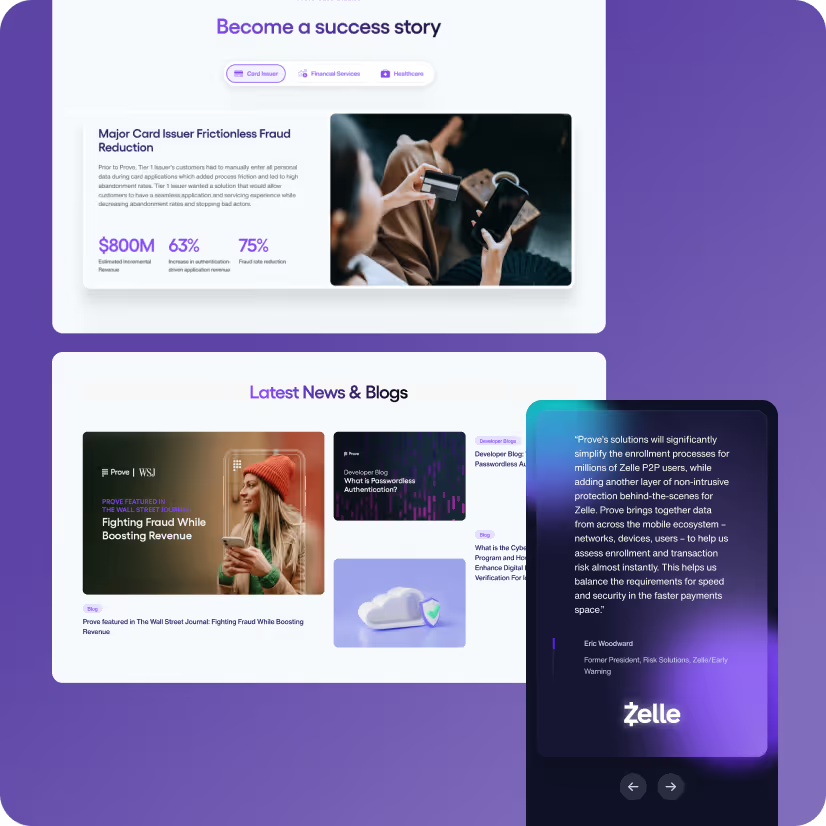
The Webflow CMS was rebuilt from scratch with an architecture built for velocity: reusable components, structured collections, and scalable templates that allow the marketing team to launch event pages, resource content, webinars, blog posts, and campaign landing pages continuously. That includes major executions like the annual Improve conference, product launches like AirKey and Unify, and account-based landing pages for specific high-value prospects. That kind of output is only possible when the system underneath is designed to support it.
As the engagement matured, the scope evolved. Prove built out an internal design and development team, and the subscription shifted accordingly. Noco moved from full execution into architecture, system design, Figma and Webflow governance, and CRO, while Prove's internal team managed day-to-day content operations. A full audit of both the Figma design system and the Webflow build was completed, with findings organized and documented for ongoing reference, and a structured knowledge transfer put in place. The design system is now formalized with design tokens, components, and a clear style guide that Prove's team can build on independently.
The most recent phase is CRO. Our CRO dashboard connects GA4, HubSpot, and behavioral data into a single performance view. Monthly reports feed prioritized experiment ideas directly into the team's Trello workflow, with the Noco design team interpreting data into hypotheses and improvement concepts. Decisions are made jointly in monthly calls. The website is moving from a platform that was built to one that continuously improves.
"We couldn't have chosen a better partner to transform our online presence to reflect our industry-leading capabilities. I highly recommend Noco to anyone looking to revamp their brand presence."
Why this matters
Prove's situation is one we recognize often. A technically excellent product, a company with serious enterprise credibility, and a website that had not kept pace with either. The problem was not that the site was broken. It was that it was not doing the job. Enterprise buyers do not just evaluate your product. They evaluate your presence. A website that looks basic signals risk, and in identity verification, risk is exactly what you are supposed to eliminate.
The rebuild addressed the surface. What made this engagement different is what happened after. The subscription model meant the site was never treated as a project to finish and hand off. It became a living system, continuously updated, audited, and improved. When Prove's internal team grew and their needs shifted, the engagement shifted with them. When the business started running more campaigns, the CMS had the architecture to support it. When performance data became the next priority, the CRO layer was already part of the subscription.
That compounding is the point. A website that launches well and then stagnates loses its edge fast, especially in a market that moves as quickly as digital identity. Building the system correctly from the start and staying embedded long enough to keep it moving is how a website becomes a growth engine rather than a finished asset.
If your website is not keeping pace with your product or your buyers' expectations, that is where we start. Explore our Enterprise Website Sprint.


Make your next move. Today.
Momentum is created in the first conversation. When the energy matches, everything else accelerates.
.webp)



-p-500.webp)


